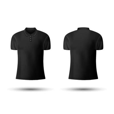
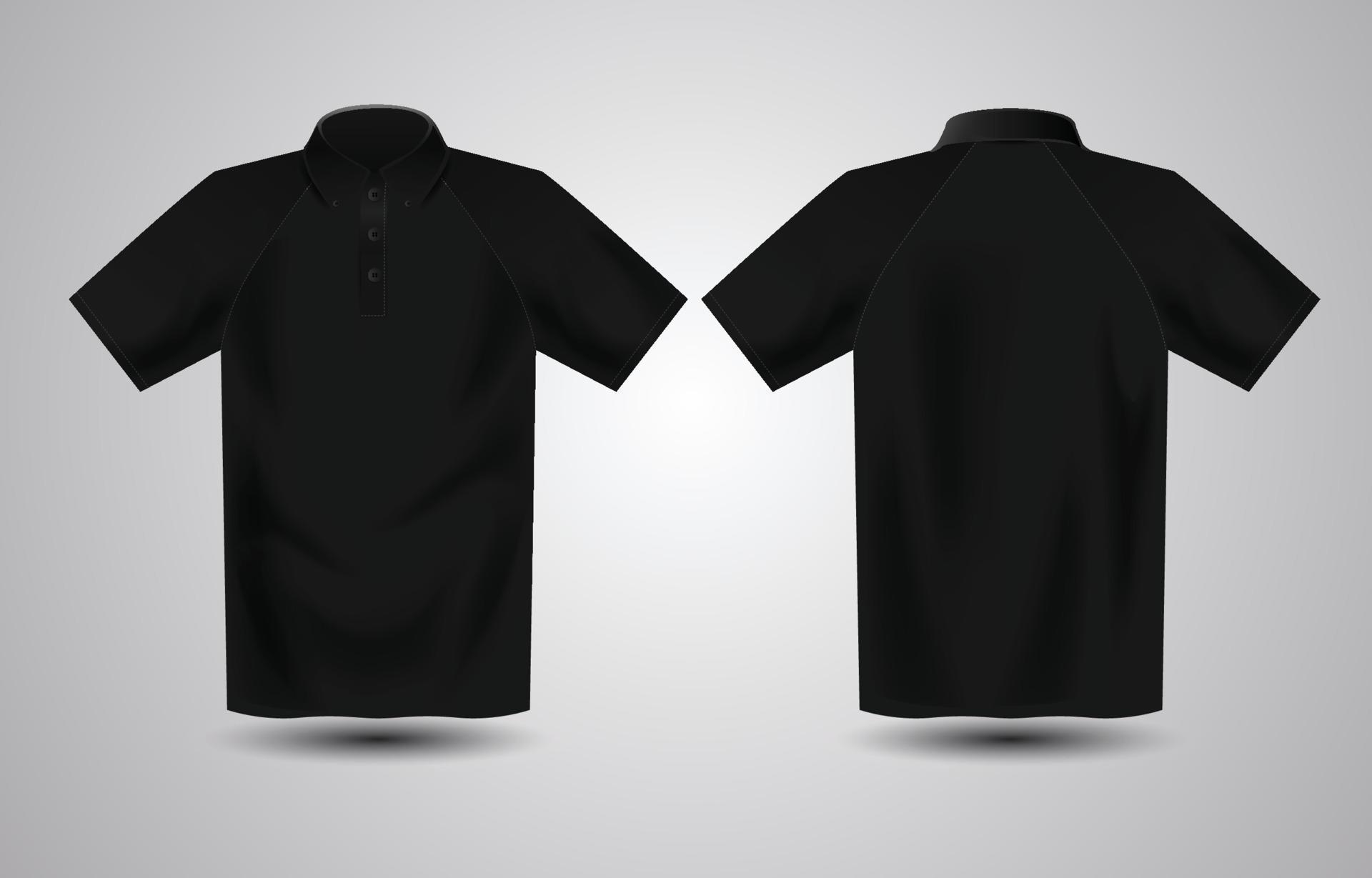
The black polo shirt. It's more than just a piece of clothing; it's a statement. Sleek, professional, and endlessly versatile, it's a staple in corporate wardrobes, event uniforms, and even casual fashion. But when it comes to branding, designing for a black polo shirt background presents a unique set of opportunities and challenges. Unlike a crisp white or light-colored canvas, black demands a different approach, a thoughtful consideration of how your design will truly pop and convey its message. This article will guide you through the art and science of creating stunning designs that not only stand out but truly shine on the sophisticated backdrop of a black polo.
Whether you're a business owner looking to outfit your team, an event organizer aiming for a polished look, or a designer tasked with bringing a brand to life, understanding the nuances of designing on black fabric is crucial. It’s about more than just picking a color; it’s about understanding contrast, print methods, and the psychological impact of your choices. Let's dive into making your designs unforgettable on this classic garment.
The Undeniable Appeal of the Black Polo
Before we even touch on design, it's worth acknowledging why the black polo shirt holds such a revered place. Its popularity isn't accidental; it's built on a foundation of practical and aesthetic advantages:
- Professionalism: Black inherently conveys authority, sophistication, and a sense of seriousness. It's a color often associated with luxury and high standards.
- Versatility: A black polo seamlessly transitions between various settings – from a boardroom meeting to a trade show floor, or even a casual team outing. It pairs well with almost any other color or style of bottom.
- Sleekness: Black has a slimming effect and offers a clean, uniform look for teams or groups. It projects a cohesive and polished image.
- Durability and Maintenance: Black fabric tends to hide minor stains and wear better than lighter colors, making it a practical choice for uniforms that see regular use.
- A Powerful Background: When designed correctly, black acts as a powerful backdrop, allowing certain colors and elements to achieve maximum impact and vibrancy.
Understanding these inherent qualities helps set the stage for how your design will be perceived. Your logo or graphic isn't just sitting on a shirt; it's interacting with these established perceptions of the black polo itself.
Navigating the Black Canvas: Key Design Principles
Designing for a black background is fundamentally different from designing for a white or light-colored one. Black absorbs light, meaning colors will react differently. What looks vibrant on screen against a white background might appear dull or lost on a black shirt if not properly considered. Here are the core principles to guide your design choices:
1. Contrast is King
This is perhaps the most critical rule. For your design to be visible and impactful on black, it must offer strong contrast. Light colors will naturally stand out more than dark ones. Think about the inverse of what you'd do for a white shirt.
- Embrace Light Colors: White, silver, gold, bright yellows, vibrant blues, electric greens, and hot pinks will pop dramatically against black. These colors create a striking visual effect that immediately grabs attention.
- Be Wary of Dark Colors: Deep navy, dark forest green, maroon, or dark purple will likely get lost in the black fabric. If you must use a dark color from your brand palette, consider outlining it with a lighter, contrasting color to help it define itself.
- Consider Metallics: Silver and gold inks or threads can add a premium, sophisticated touch that truly shines on black, catching the light and adding depth.
2. Simplicity and Clarity
While intricate designs can be beautiful, they often lose their impact on a black background, especially when translated to fabric. Simplicity is your ally here.
- Clean Lines and Bold Shapes: Designs with clear, defined edges and solid shapes tend to read much better. Avoid overly complex patterns or fine details that might bleed or get muddled during the printing process.
- Less is Often More: A single, well-placed, impactful element will often be more effective than a busy design with too many competing elements. Let your core message or logo breathe.
3. Thoughtful Color Palette Selection
Beyond just contrast, the specific colors you choose will influence the mood and impact of your design.
- Warm vs. Cool: Bright warm colors (reds, oranges, yellows) can create a dynamic, energetic feel. Cool colors (light blues, teals, lime greens) can offer a fresh, modern, or calming vibe.
- Brand Consistency: While you might need to adapt your brand's color palette, try to maintain its essence. If your brand uses a specific shade of blue, find the brightest, most contrasting version of that blue that works on black.
- Limited Palette: Often, using one or two strong, contrasting colors is more effective than trying to incorporate too many. This keeps the design focused and prevents it from looking cluttered.
4. Legible Typography
Your text needs to be easily readable from a distance, even on a black background.
- Font Choice: Opt for clear, legible fonts. Sans-serif fonts often work well due to their clean lines. Avoid overly thin, highly decorative, or script fonts that might be difficult to decipher.
- Font Weight: Bold or medium-weight fonts are generally preferred over light or ultra-light weights, which can disappear.
- Color and Contrast: Ensure your text color provides excellent contrast with the black background. White, light grey, or bright brand colors are usually good choices.
Technical Considerations: Bringing Your Design to Life
The best design in the world won't look good if the printing method isn't appropriate for a black polo shirt. Understanding the technical aspects is crucial for a successful outcome.
Print Methods for Black Fabric
- Screen Printing: This is the most common and durable method. For light colors on black fabric, an "underbase" of white ink is almost always required. This white layer is printed first, then the actual color is printed on top, preventing the black fabric from dulling the color. Without an underbase, colors can look muted or blend into the black.
- Direct-to-Garment (DTG) Printing: Ideal for complex designs, gradients, and full-color images. Similar to screen printing, DTG also requires a white underbase on black garments to ensure colors are vibrant and true to the design.
- Embroidery: For a classic, textured, and premium look, embroidery is excellent. Thread colors are generally vibrant on black. This method is particularly good for logos and text, though very fine details can be challenging.
- Heat Transfer Vinyl (HTV): Best for simpler designs, numbers, or names, and for specific effects like metallic, glitter, or neon. HTV is cut from rolls of vinyl and heat-pressed onto the shirt. It offers excellent opacity and vibrant color.
The Importance of the Underbase
We've mentioned it twice already, but it bears repeating: for screen printing and DTG on black shirts, an underbase is critical. Think of it like priming a wall before painting a bright color over a dark one. The white underbase creates a neutral, opaque layer that allows the top colors to appear true and vibrant, rather than being absorbed and dulled by the black fabric. Always confirm with your printer that an underbase will be used for your design if it features light or bright colors.
Common Pitfalls to Avoid
- Forgetting the Underbase: As discussed, this leads to dull, faded colors.
- Using Low-Resolution Files: Ensure your artwork is high-resolution (vector files are best) to prevent pixelation and blurriness.
- Ignoring Fabric Type: Different fabrics (100% cotton, polyester blends) can affect how ink sits and cures. Discuss this with your printer.
- Overly Complex Designs: Fine lines and intricate details often get lost, especially with certain print methods.
- Not Getting a Proof: Always ask for a digital mockup, and if possible for large orders, a physical sample. This allows you to catch any issues before full production.
Tips for a Successful Black Polo Design
- Work with Your Printer: Share your design and get their expert advice on the best print method and color adjustments for black fabric. They are your best resource.
- Consider Your Audience: Who will be wearing these shirts? What message are you trying to convey? This influences color choices and design style.
- Think About Placement: Standard placements include the left chest, full back, or sleeve. Consider how the design interacts with the polo's buttons, collar, and seams.
- Test, Test, Test: If budget allows, print a single sample before committing to a large order. This is the ultimate way to ensure satisfaction.
- Embrace the Black: Instead of fighting the black, let it enhance your design. Use it as a powerful negative space or a dramatic backdrop.
Final Thoughts
Designing for a black polo shirt background is an art form that, when mastered, can elevate your brand and make a powerful visual statement. It requires a keen understanding of contrast, simplicity, and the technicalities of printing on dark fabric. By prioritizing clear, legible elements, choosing colors that truly pop, and working closely with experienced printers, you can transform a classic black polo into a vibrant, professional, and memorable canvas for your brand. Embrace the elegance of black, and watch your designs truly shine.


