The humble polo shirt. It’s a wardrobe staple, a team uniform hero, and a powerful branding tool. From corporate casual to sports teams, school clubs to family reunions, polos offer a fantastic blend of comfort and smart style. But getting that perfect custom polo isn't just about picking a color and sending off a logo. There's a crucial, often overlooked, step that can make all the difference between a good polo and a great one: carefully reviewing your polo shirt design layout pictures.
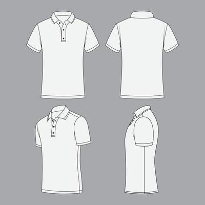
Think of design layout pictures, also known as mock-ups or digital proofs, as your sneak peek into the future. They are digital representations of what your finished polo shirt will look like with your specific design, logo, or text applied. This isn't just a formality; it's your last chance to catch errors, fine-tune details, and ensure your vision translates perfectly onto the fabric. Skipping this step is like baking a cake without looking at the recipe – you might get something edible, but it probably won't be what you imagined.
Why Design Layout Pictures Are Your Best Friend
Before any ink touches fabric or needle stitches thread, these digital proofs offer invaluable benefits:
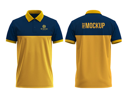
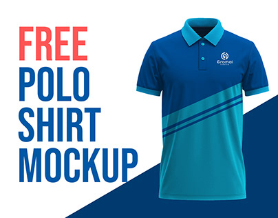
Visualize the Final Product: It's hard to imagine how a flat logo will look on a three-dimensional shirt. Layout pictures provide a realistic preview, showing you the design in context on the actual polo shirt style you've chosen.
Catch Errors Early: This is perhaps the most critical benefit. A misplaced logo, a misspelled word, an incorrect color – these are all easily fixable in a digital proof. Once production starts, changes become costly, if not impossible.
Ensure Brand Consistency: For businesses and organizations, maintaining consistent branding is paramount. Layout pictures allow you to verify that your logo's size, colors, and placement adhere to your brand guidelines across all items.
Make Informed Decisions: Seeing the design on a mock-up can spark new ideas or confirm your initial choices. You might realize a logo looks better slightly larger, or a different color combination pops more effectively.
Save Time and Money: By preventing mistakes before production, you avoid the need for costly re-runs, wasted materials, and delays. A few minutes spent reviewing a proof can save hours and hundreds of dollars.
What to Scrutinize When Viewing Your Polo Shirt Layout Pictures
Don't just glance and approve. Take your time and go through a systematic checklist. Here’s what you should be looking for:
Placement and Position
Where exactly is your design going to sit on the shirt? This is crucial for impact and aesthetics.
Left Chest: This is the most common placement. Is it at the right height? Not too close to the collar or too low towards the waist? Does it align correctly with the placket (button area)?
Right Chest: Less common but can be effective. Ensure it balances with the left side if there's no design there, or complements a design on the left.
Sleeve: For sleeve designs, is it on the left or right sleeve? Is it centered on the sleeve, or slightly towards the front or back? What's its distance from the shoulder seam or cuff?
Back: If you have a large back design, is it centered horizontally and vertically? Is it too high, potentially hidden by a collar, or too low, nearing the hem?
Collar/Nape: For subtle branding, some designs are placed on the back of the collar or just below it. Check for size and visibility.
Size and Scale
A design that looks great on your computer screen might look tiny or overwhelming on a shirt.
Proportion to the Shirt: Does the logo look appropriately sized for the polo? Is it too dominant or too insignificant?
Readability: Is text still legible at the chosen size? Small details in a logo can get lost if the design is too small.
Consistency Across Sizes: If you're ordering various shirt sizes (S, M, L, XL), ask if the design size will be adjusted slightly for larger shirts, or if a single size will be used. A logo that looks good on a small might appear small on an XXL.
Color Accuracy and Vibrancy
Colors on a screen can look different from how they appear in print or embroidery.
Pantone Matching System (PMS): If you provided PMS colors, verify that the proof reflects these specific shades. Screen colors (RGB) are notoriously unreliable for print accuracy.
Interaction with Fabric Color: How do your design colors look against the chosen polo shirt color? Do they pop, or do they get lost? Sometimes a slight shade adjustment can make a huge difference.
Embroidery Thread Colors: If your design is embroidered, the proof should indicate the thread colors. Ensure they match your brand's palette.
Detailing and Method Specifics
The production method (embroidery, screen print, DTG) impacts the final look.
Embroidery: Look at how fine details are represented. Will small text be legible? Does the stitch direction look appropriate? Are gradients handled correctly (often simplified in embroidery)?
Screen Printing/DTG (Direct-to-Garment): Check for crisp lines, smooth color transitions, and overall clarity. Ensure no unintended blurring or pixelation.
Text and Fonts: Double-check every single letter, number, and punctuation mark. Is the correct font used? Are there any typos? This is where many common errors occur.
Overall Aesthetic and Balance
Beyond the technical details, step back and consider the overall impression.
Does the design feel balanced on the shirt?
Does it convey the message or brand identity you intended?
Does it simply "look good" to you and others?
Tips for an Effective Review Process
Take Your Time: Don't rush. Review the proof when you're fresh and focused.
Get a Second Opinion: Ask a colleague, friend, or team member to look at it. A fresh pair of eyes can spot things you missed.
Print It Out (If Possible): Viewing a digital image on a screen is different from seeing it on paper. Printing it can give you a better sense of scale and color, even if it's not perfectly accurate.
Compare to Your Original Brief: Hold the layout picture up against your initial design request or brand guidelines. Does everything match?
Ask Questions: If something looks off or you're unsure, don't hesitate to ask your supplier for clarification or adjustments. It's their job to help you get it right.
Different Polo Types and Design Considerations
It's also worth remembering that the type of polo shirt itself can influence how a design looks. A design might sit differently on a men's cut versus a women's cut due to varying body shapes. Performance fabrics, often smoother and stretchier, can take prints differently than traditional pique cotton, which has a textured, waffle-like weave. Always ensure your layout picture is on the *exact* polo style, fabric, and color you intend to order.
In conclusion, viewing polo shirt design layout pictures is far more than a mere formality; it's a critical checkpoint in the journey from concept to creation. By diligently scrutinizing every detail – from placement and size to color accuracy and overall aesthetic – you empower yourself to make informed decisions, prevent costly errors, and ultimately ensure your custom polo shirts perfectly embody your vision. Don't underestimate this step; it's your best tool for achieving a truly successful and striking custom apparel outcome.